I love color. Who doesn’t?

I love yarn too, but maybe not everyone else does. (Maybe.)
I’m taking an online art course that’s teaching me more about color.
Excuse me for sounding smug, but I thought I knew all about color. After all—I mean to say—my mother was a gung-ho, encourage-creativity-in-the-children, artistic-herself kind of mom; I took art classes in high school and college; I’ve taken workshop classes over the years; I was always a good student and I have a good memory. I quilt. I crochet. I knit, sew, and weave.

Detail of “Teapot Dome” quilt, Nov 2012
People tell me I’m good with color.
So, why sign up for the class? Well, it was free, for one thing. And I really, really like the teacher. Did I think I would or wouldn’t learn anything? I’m not sure about that. I figured I would enjoy it.

“Houndstooth Check” pattern
Class started and I dispatched the first assignments right off, the first day. Then it slowed way down—other students weren’t as swift to keep up, the teacher got sick. Lessons trickled in. And I wasn’t enjoying the class anymore. What??? Yeah, no. I thought the pace too slow and there was too much paint sampling on paper (two potentially wasted materials: paint and paper; oh, and time makes three).

This is a collection of some of the more interesting (to me) assignments
It became difficult to get myself to work on the lessons. I’d read them from time to time, but there was no hurry… Eventually I was behind and had to force myself to catch up.

My warm and cool color wheel collage assignment
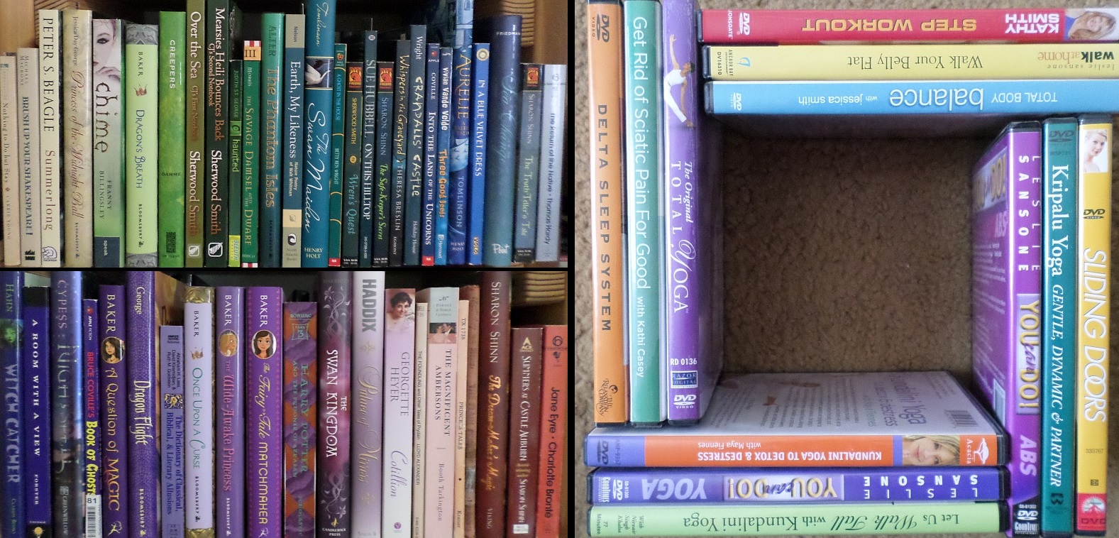
All the while, a strange thing was happening backstage. I, who thought I knew it all, was being influenced by the lessons. (Though I wasn’t doing them, I kept reading them over and over with the intention to act one day.) I started noticing colors and color schemes. I saw them in the books on my shelves, DVDs below the TV set, other people’s Facebook photos, and even in the General Conference issue of The Ensign (church magazine) I was reading.
Analogous Colors and Triads

Guest Artist: Mary Pavis Egbert—from Facebook. (Photo used by permission.) Look at the beautiful mix of colors from yellow, raspberry, and cyan dyes. The wool cries out to be handled!

Guest Artist: Karen Thomson (also from Facebook)—7 Chakras worked in felted wool. (Photo used by permission.) A beautiful reminder of the health and healing aspects of color.

Photo from Ensign magazine, May 2017, p 7—Analogous color scheme in a random candid photo?
Unexpected outcome! But I have to admit I was still struggling—time marching on, life happening in a not-totally-pleasant way. In class we weren’t doing “real art” though some of us couldn’t resist practicing our knowledge in various ways.

Blue, blue-violet, violet, red-violet (journal page)

blue, blue-green, green (journal page)
Last night I finished up the “reflection” lesson for section 2 and read over the material for the first lesson in section 3—which got me all caught up. I knew my sensitivity to color was heightened, but I still wasn’t sure how to put it into action. I mean, I didn’t want ONLY to keep rearranging the books and DVDs on my shelves, or to draw and paint backgrounds and doodles.
Overnight something clicked in my brain. In the past when I’ve looked at a photo, say with the intent that I might like to use it as a reference for a work of art, I’ve almost always focused on THE IMAGE, what’s depicted, the object—NOT THE COLOR.
If you look at the photo of the women above, you’ll see three fairly ordinary looking people. Forgive me for saying they’re not beauty queens (I think they’re lovely though). Yet it’s a very attractive photo. Why? Because of the colors, mainly.
When I make art, I generally draw a picture of something first, then add paint—halfway between the coloring book mindset and the mind of an artist. (But practice, practice, practice makes a great difference in my skill level; being out of art-practice is truly akin to being physically out of shape.) Slowly enlightenment is dawning—I might be able to learn to USE color in my artwork instead of it happening to fall onto the page. A little more practice—and a lot less avoidance—is required.
Today I spent a few hours collecting photos for section 3 of the class. I forced myself to NOT add all the lions, moose, birds, autumn leaves, or even poppies to my COLOR-INFLUENCED scrapbook. I focused on color. There are three photos featuring poppies, and naturally there’s a lot of green, but I feel quite disciplined about my choices. Maybe tomorrow I’ll survey photos of ballet dancers. (Color, Sue! Focus on color.)